What Makes A Call-To-Action More Effective?
TL;DR
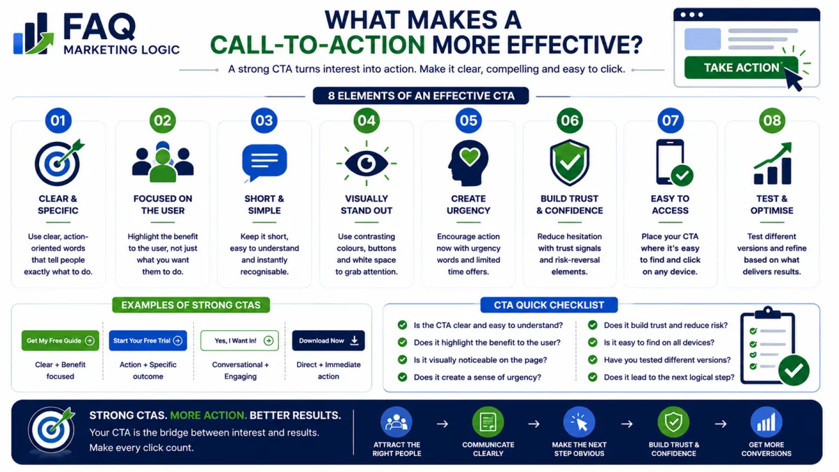
A call-to-action (CTA) becomes more effective when it is clear, relevant, and easy to act on. The best CTAs reduce hesitation by telling visitors exactly what they will gain from taking the next step.
IN SHORT
An effective call-to-action encourages visitors to take one specific action.
Strong CTAs:
Use clear language.
Focus on benefits.
Stand out visually.
Match the visitor's intent.
Create confidence without pressure.
A CTA should never leave visitors wondering what happens next.
REAL TALK
Many businesses spend hours choosing button colours while ignoring the message on the button itself.
Changing a blue button to green rarely transforms results.
Changing a vague CTA into one that clearly explains the benefit often does.
Visitors don't click because the button looks attractive.
They click because they understand the value of taking the next step.
Key Definition
A call-to-action (CTA) is any button, link, or prompt that encourages a visitor to complete a specific action.
Examples include:
Download a free guide.
Join the newsletter.
Book a consultation.
Start a free trial.
Buy now.
Every landing page should have one primary CTA that aligns with its objective.
Why Some CTAs Perform Better Than Others
They Tell Visitors What Happens Next
Avoid generic wording like:
Submit
Continue
Click Here
Instead, explain the outcome.
Examples include:
Download Your Free Guide
Start Your Free Trial
Get Instant Access
Book Your Free Consultation
Visitors are more likely to act when they know exactly what to expect.
They Focus On Benefits
People don't click because they want to press a button.
They click because they want the result the button promises.
Instead of describing the action, emphasise the value.
For example:
"Get My Marketing Checklist"
is more compelling than
"Download PDF."
They Match The Visitor's Intent
A visitor who is learning about a topic may not be ready to buy.
Likewise, someone comparing products may not want to subscribe to another newsletter.
Your CTA should reflect where the visitor is in their journey.
The more relevant the next step feels, the higher the likelihood of conversion.
They Stand Out Clearly
Visitors should never have to search for the next step.
A CTA should be easy to find, visually distinct, and positioned where it naturally follows the information on the page.
If visitors miss it, they can't click it.
They Reduce Uncertainty
People hesitate when they fear making the wrong decision.
Simple reassurance around your CTA can increase confidence.
Examples include:
No credit card required.
Instant access.
Unsubscribe at any time.
Free download.
Reducing perceived risk often improves conversions.
Practical Example
Imagine two landing pages offering the same free report.
Page A ends with a button that says:
Submit
Page B ends with:
Download My Free Marketing Guide
Below the button is a short message:
"Instant download. No spam. Unsubscribe whenever you like."
Both pages offer exactly the same report.
However, Page B makes the outcome clearer and removes uncertainty, making visitors more likely to click.
Common Mistake
Mistake:
Adding several different calls-to-action on the same page.
Fix:
Choose one primary action and make it the clear focus of the page.
When visitors have too many choices, they often choose none.
FAQ Quick Fix
Review your main CTA by asking:
Is the benefit obvious?
Does it explain what happens next?
Is it easy to find?
Does it match the visitor's goal?
Does it reduce uncertainty?
If the answer is "yes" to all five, your CTA is far more likely to convert.
RELATED ARTICLES
→ How Do I Increase Landing Page Conversions?
→ What Information Should A Landing Page Include?
→ Why Do People Hesitate Before Buying?
QUICK RECAP
Effective calls-to-action are:
Clear
Benefit-focused
Relevant
Easy to find
Low risk
A good CTA removes hesitation and makes the next step feel obvious.
NEXT STEP
Once you've created an effective call-to-action, the next step is deciding how much information your page should include before asking visitors to act.
Read: