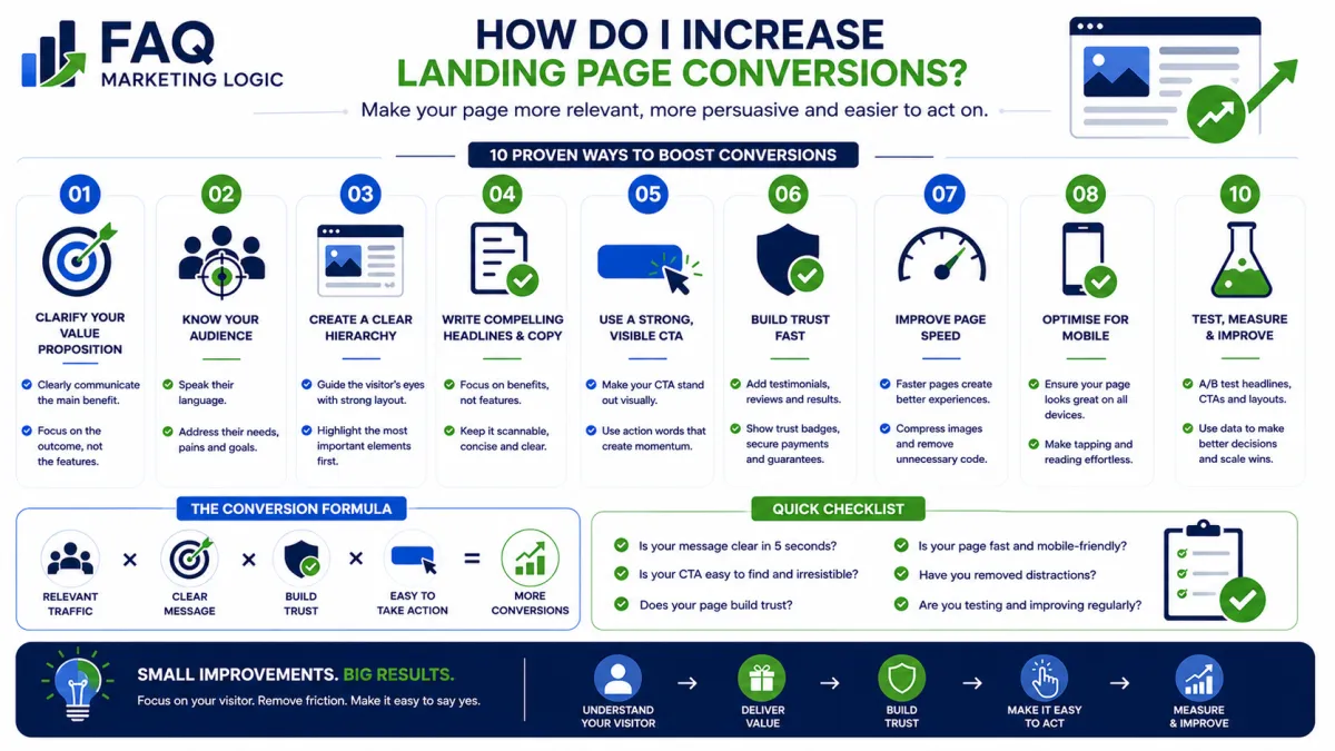
How Do I Increase Landing Page Conversions?
TL;DR
Increase landing page conversions by making your page clearer, more relevant, and easier to act on. Remove distractions, strengthen trust, and give visitors one obvious next step.
IN SHORT
Landing page conversions improve when visitors immediately understand:
What you're offering.
Who it's for.
Why it matters.
What they should do next.
Most landing pages don't fail because of a lack of traffic.
They fail because visitors become confused, distracted, or uncertain before taking action.
Small improvements in clarity and trust often produce bigger gains than simply attracting more visitors.
REAL TALK
Many beginners assume low conversions mean they need more visitors.
Usually, they don't.
Sending more traffic to a page that isn't converting simply creates more people who leave without taking action.
Before increasing your advertising budget or chasing more website traffic, make sure your landing page gives visitors a compelling reason to stay and an obvious reason to act.
Improving conversions is often the fastest way to grow without increasing your marketing costs.
Key Definition
Landing page conversion is the percentage of visitors who complete the action your page was designed to achieve.
That action might be:
Joining your email list.
Downloading a guide.
Booking a call.
Purchasing a product.
Registering for a webinar.
The goal is to reduce friction so more visitors become leads or customers.
Why Landing Pages Don't Convert
Visitors typically leave for one of four reasons:
1. The Message Isn't Clear
Within a few seconds, visitors should understand exactly:
What you're offering.
How it helps them.
Why they should care.
If they have to work it out themselves, many will simply leave.
2. The Offer Doesn't Feel Valuable
People exchange their time, attention, and information for something valuable.
Ask yourself:
"Would I willingly give my email address for this?"
If the answer is uncertain, strengthen the offer before changing the design.
3. There Isn't Enough Trust
Visitors buy confidence before they buy products.
Build trust with elements such as:
Testimonials.
Customer reviews.
Results.
Experience.
Clear contact information.
Professional design.
Every trust signal reduces perceived risk.
4. Too Much Friction
Every unnecessary step reduces conversions.
Examples include:
Long forms.
Multiple calls-to-action.
Slow-loading pages.
Confusing navigation.
Too much text before the offer.
The easier the decision, the more likely visitors are to act.
Five Ways To Increase Landing Page Conversions
Clarify Your Headline
Your headline should communicate the primary benefit immediately.
Avoid clever wording.
Choose clarity instead.
Guide Visitors Towards One Clear Action
Every landing page should have one primary objective.
Whether you want visitors to download a guide, join your email list, or make a purchase, every element on the page should support that single goal.
When visitors are presented with too many choices, they often choose none at all.
A dedicated article will explore how to create more effective calls-to-action.
Remove Distractions
A landing page has one purpose.
Remove anything that competes with that objective, including unnecessary navigation links, unrelated offers, or excessive information.
Focus increases conversions.
Reinforce Benefits
Don't simply describe features.
Explain how those features improve the visitor's situation.
People respond to outcomes more than specifications.
Test One Change At A Time
Changing everything at once makes it impossible to know what improved results.
Instead, test individual elements such as:
Headlines.
CTA buttons.
Images.
Form length.
Testimonials.
Small improvements often compound into significant gains over time.
Practical Example
Imagine two landing pages offering the same free marketing guide.
Page A has:
A vague headline.
Three different offers.
Minimal trust signals.
A long registration form.
Page B has:
A clear benefit-driven headline.
One focused call-to-action.
Testimonials.
A simple name-and-email form.
Clear explanation of what visitors receive.
Both pages receive identical traffic.
Page B is far more likely to convert because visitors experience less confusion and greater confidence.
Common Mistake
Mistake:
Trying to improve conversions by constantly increasing traffic.
Fix:
Optimise the landing page first.
When more visitors convert, every future marketing activity becomes more profitable.
FAQ Quick Fix
If your landing page isn't converting, review these five questions:
Is the headline immediately clear?
Does the offer solve a real problem?
Are trust signals visible?
Is there only one primary call-to-action?
Can visitors complete the action with minimal effort?
If you answer "no" to any of these, that's usually where your biggest improvement opportunity lies.
RELATED ARTICLES
→ What Should Be Above The Fold On A Landing Page?
→ What Information Should A Landing Page Include?
→ What Causes Low Conversion Rates?
QUICK RECAP
Higher landing page conversions come from:
Clear messaging
Relevant offers
Strong trust
Simple user experience
Continuous testing
Small improvements across each area often produce significant long-term growth.
NEXT STEP
Once visitors understand your offer, the next step is learning how to encourage more of them to click.
Read: