How Do I Make My Sales Page Easier To Understand?
TL;DR
A sales page becomes easier to understand when visitors can quickly recognise what you're selling, who it's for, how it helps and what they need to do next.
You don't necessarily need shorter copy. You need clearer explanations, a logical structure and fewer distractions.
The aim is to remove unnecessary effort from the buying decision. When people understand the offer without having to work everything out for themselves, they can make a more informed decision about whether it's right for them.
IN SHORT
To make your sales page easier to understand, concentrate on clarity before persuasion.
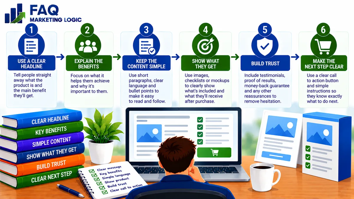
Your headline should communicate the main benefit. Your opening paragraphs should explain the problem and introduce the solution. The rest of the page should provide the information visitors need to evaluate the offer.
Use familiar language, short sections, specific examples and clear calls to action.
Avoid overwhelming readers with technical terms, unrelated bonuses or several competing messages.
A good sales page doesn't simply contain the right information. It presents that information in an order that makes sense to the customer.
WHY THIS WORKS
Make The Main Offer Immediately Clear
When someone arrives on your sales page, they shouldn't have to read several paragraphs before understanding what you're offering.
Visitors usually want to establish a few basic things.
What is this product? Is it intended for someone like me? What problem does it help solve? Why should I consider buying it?
If those questions remain unanswered, visitors may leave before discovering the value of your offer.
Start by looking at your headline and opening section.
Do they explain a recognisable benefit, or do they rely on clever wording that sounds impressive without communicating anything specific?
For example, a headline promising to "Unlock Your Unlimited Digital Potential" might create curiosity, but it doesn't explain what the product actually does.
A clearer alternative could be:
"Learn How To Plan And Create Your First Digital Product."
The second version identifies the subject and the intended outcome.
It may not be the most exciting headline imaginable, but it gives the visitor something useful to understand immediately.
Explain The Product In Plain Language
One of the easiest ways to confuse potential customers is to describe a product using language they don't normally use.
Terms that seem obvious to an experienced marketer may mean very little to someone starting their first online business.
For example, describing a product as an "integrated digital monetisation framework" tells a beginner remarkably little.
Explaining that it shows them how to choose, create and sell a digital product is much easier to understand.
This doesn't mean removing every technical term.
Some subjects require specific terminology, and experienced audiences may expect it.
However, unfamiliar terms should be explained when they're important to the buying decision.
The best test is whether someone in your intended audience could describe the product accurately after reading the opening section.
If they can't, the explanation probably needs simplifying.
Follow The Customer's Questions
A sales page becomes easier to follow when its sections answer questions in a sensible order.
Imagine someone considering a training programme about creating information products.
They may first want to know what the programme helps them accomplish.
Next, they might wonder whether it suits their experience level.
Then they'll want to understand what the programme includes, how it's delivered and what it costs.
Finally, they may need reassurance about practical requirements, support or refund terms.
A page that answers these questions naturally feels easier to navigate.
A page that jumps between unrelated benefits, testimonials, bonuses and promotional claims can make the same offer seem unnecessarily complicated.
You don't have to use a rigid formula for every sales page.
However, arranging information around the customer's decision-making process provides a useful starting point.
Focus On One Main Message
A sales page should have a clear purpose.
If you're selling a digital guide, the main objective is to help suitable visitors decide whether to purchase that guide.
Problems arise when the page tries to accomplish several unrelated things at once.
You might introduce a course, promote a membership, encourage newsletter subscriptions and recommend another product before the visitor has understood the original offer.
Each additional choice creates another opportunity for distraction.
That doesn't mean you cannot mention supporting resources or related benefits.
However, the central message should remain consistent.
The headline, examples, benefits and calls to action should all support the same offer.
If visitors are unsure what you want them to do, your page may be asking them to consider too many things.
Explain Benefits Without Hiding The Details
Benefits help visitors understand why a product matters.
Features explain what they're actually receiving.
A useful sales page needs both.
For example, telling someone that a workbook will help them organise their first digital product idea communicates a potential benefit.
Explaining that the workbook includes a product comparison worksheet, a market research checklist and a planning template tells them what they'll receive.
Neither explanation is sufficient on its own.
A list of features without benefits can feel like a catalogue of contents.
A collection of benefits without supporting details can sound vague.
Connect the two.
Explain what the customer receives and how each important component helps them make progress.
This makes the value easier to understand without relying on exaggerated promises.
Use Examples To Explain Complicated Ideas
Sometimes a concept is difficult to explain in a single sentence.
Rather than adding more abstract language, use an example.
Suppose you're selling a guide about choosing an online business model.
You could explain that the guide helps readers evaluate opportunities according to their available resources.
That's useful, but still fairly general.
You could then describe how someone with limited time might compare a service business requiring regular client work with a digital product business that involves more development before making sales.
The example gives the visitor a clearer picture of how the guide might help.
Examples are particularly useful when selling information products because customers cannot physically inspect the knowledge they're purchasing.
A realistic demonstration can make the contents and intended outcome easier to visualise.
Make The Page Easy To Scan
Not every visitor reads a sales page from beginning to end.
Some will read the headline, look through the subheadings, examine the product details and return to sections that interest them.
A clear visual structure helps these visitors understand the offer.
Use descriptive subheadings that explain what each section covers.
Keep paragraphs manageable and separate different ideas rather than presenting everything in one large block of text.
Bullets can help when listing product contents, requirements or specific features, but they shouldn't replace every explanation.
Images, screenshots or previews can also be useful when they show something meaningful about the product.
Avoid adding visual elements simply because they make the page look busier.
The purpose of the layout is to help people understand the offer, not to compete with the message.
Clear presentation is particularly important when you're using a sales letter to promote a product. The message needs to guide readers naturally from understanding the problem to considering the solution.
If you're interested in how a well-written sales message can continue working over time, One Letter From Retirement explores that approach.
Make The Buying Process Obvious
Even when visitors understand the product, they still need to know how to purchase it.
Your call to action should make the next step clear.
For example, "Get Instant Access To The Workbook" explains more than a button labelled "Continue."
The surrounding information should also remove uncertainty.
Visitors may need to know the price, whether the payment is one-time or recurring, what happens after purchase and whether any additional software is required.
If you're offering a guarantee, explain its actual terms rather than relying on vague reassurance.
Clear purchase information helps customers make decisions with confidence.
It can also reduce misunderstandings and unnecessary support enquiries.
Remove Anything That Doesn't Help The Decision
Once you've written a sales page, it's worth reviewing every section.
Ask whether it helps visitors understand the product, recognise its relevance, evaluate its value or decide what to do next.
If a paragraph repeats something you've already explained, consider removing it.
If a testimonial introduces an unrelated subject, it may not belong on the page.
If a bonus requires several paragraphs of explanation but adds little meaningful value, it may be creating more confusion than interest.
This doesn't mean every sales page should be short.
Some offers require detailed explanations, particularly when they're expensive, unfamiliar or involve a significant commitment.
The objective is to remove unnecessary complexity while retaining the information customers need.
A longer page can be perfectly clear when every section has a purpose.
PRACTICAL EXAMPLE
Imagine you're selling a $49 digital guide about creating your first information product.
Your original sales page begins with a headline promising a complete online business transformation.
It then introduces several marketing concepts, lists twelve bonuses and describes the guide as a comprehensive digital publishing system.
Only halfway down the page do visitors discover that the main product is a beginner's guide to planning and creating a digital product.
The offer may be useful, but the explanation makes it difficult to understand.
You decide to simplify the page.
The new headline explains that the guide helps beginners plan and create their first digital product.
The opening section identifies the main problem: having useful knowledge but not knowing how to turn it into something people can purchase.
You then explain what the guide covers, show a sample planning worksheet and describe the practical steps readers will work through.
The price, delivery method and purchase button are clearly presented.
You haven't necessarily reduced the amount of useful information.
You've reorganised it around what the customer needs to know.
The page is now easier to follow because the main offer remains clear throughout.
REAL TALK
Sales pages often become complicated because the person writing them is trying too hard to make the product sound impressive.
Every feature becomes revolutionary. Every benefit becomes life-changing. Every paragraph introduces another reason the reader absolutely must buy.
Unfortunately, that approach can make an ordinary, useful product sound less believable.
Most customers don't need a dramatic explanation of why a workbook, guide or training programme exists.
They need to understand what it does and whether it will help them.
Clear sales copy doesn't mean dull sales copy.
You can still use persuasive language, interesting examples and a compelling explanation of the problem.
But persuasion works better when the reader understands what you're talking about.
If someone finishes reading your sales page and still cannot explain what they're buying, adding more persuasive language probably isn't the answer.
You need to make the offer clearer.
COMMON MISTAKES
Mistake: Using a clever headline that doesn't explain the offer.
Visitors see an attention-grabbing statement but cannot identify what the product helps them achieve.
Fix: Make the main benefit understandable before adding curiosity or creative wording.
Mistake: Introducing too many ideas at once.
The page moves between different products, benefits and promotional messages without a clear direction.
Fix: Concentrate on one main offer and organise supporting information around it.
Mistake: Describing features without explaining their value.
You list modules, templates and bonuses but leave customers to work out why they matter.
Fix: Connect important features with the practical benefits they provide.
Mistake: Making the page shorter by removing essential details.
You simplify the copy so much that visitors cannot understand the contents, requirements or purchase terms.
Fix: Remove repetition and unnecessary complexity while keeping the information needed for an informed decision.
Mistake: Using vague calls to action.
Visitors aren't sure what happens when they click the purchase button.
Fix: Use clear button text and explain the price, delivery and next step.
FAQ QUICK FIX
Want to make your sales page easier to understand without rewriting everything?
Start with the opening section and work through these five checks.
1. Check the headline.
Can a new visitor understand the main benefit without reading the rest of the page?
2. Explain the product.
Does the opening section clearly identify what you're selling and who it's intended for?
3. Review the order of information.
Do the sections answer the customer's likely questions in a sensible sequence?
4. Remove unnecessary complexity.
Are there repeated claims, confusing terms or unrelated details that make the offer harder to follow?
5. Clarify the next step.
Can visitors easily find the price, understand what happens after purchase and identify the correct action to take?
You don't need to change every sentence.
Improving the clarity of the headline, opening explanation and purchase information can be a useful starting point.
FAQ
Should A Sales Page Be Short Or Long?
The appropriate length depends on the offer and the information customers need. A simple, inexpensive product may require less explanation than a complex or higher-priced programme. Clarity matters more than word count.
What Should Visitors Understand First?
They should quickly understand what the product is, who it's for and the main problem or goal it addresses. The rest of the page can then explain the details and support the buying decision.
Do Bullet Points Make Sales Pages Easier To Read?
They can help visitors scan lists of features, contents or benefits. However, paragraphs are often better for explaining ideas, providing context and answering more complicated questions.
How Do I Explain A Complicated Digital Product?
Start with the main problem and intended outcome. Then introduce the important components one at a time, using plain language and practical examples where necessary.
Can Too Many Bonuses Reduce Sales?
Potentially. Bonuses can add value, but an excessive or poorly explained collection may distract visitors from the main product. Include bonuses that genuinely support the offer.
How Do I Know If My Sales Page Is Confusing?
Ask someone unfamiliar with the product to read the page and explain what it offers, who it's for, what it costs and what happens after purchase. Their answers can reveal unclear sections.
TRY THIS TODAY
Open one of your existing sales pages and read only the headline, opening section and main subheadings.
Don't read the full body copy yet.
Now ask yourself:
Can I immediately identify the product?
Is the intended customer obvious?
Does the main benefit make sense?
Can I follow the page's argument from the subheadings alone?
Are there unfamiliar terms that need explaining?
Does every section support the same offer?
Is the price easy to find?
Is the purchase process clear?
Are important product requirements explained?
Would a first-time visitor understand what happens after buying?
Next, write a simple explanation of the offer in two sentences.
The first should describe what the product helps customers achieve.
The second should explain what they receive and how it helps.
Compare those sentences with your existing opening copy.
If your new explanation is clearer, use it as the starting point for improving the page.
You don't need to rebuild the entire sales page today.
Begin by making the main offer easier to understand.
Want To See How A Sales Message Can Keep Working For You?
Making a sales page easier to understand is an important part of improving its effectiveness.
But clear information is only the beginning.
A well-written sales message also needs to hold attention, explain the value of the offer and help suitable customers make a decision.
If you'd like to explore how an effective sales letter can become a long-term marketing asset, One Letter From Retirement introduces an approach built around persuasive sales messages that can continue working beyond a single promotion.
→ Discover One Letter From Retirement
RELATED ARTICLES
→ What Should Be Above The Fold On A Landing Page?
→ How Do I Structure A High-Converting Sales Page?
→ What Information Should A Landing Page Include?
QUICK RECAP
A sales page becomes easier to understand when it presents the right information in a clear and logical order.
Explain the main offer immediately.
Use language your intended customers understand.
Arrange sections around the buyer's questions.
Keep the page focused on one main message.
Connect product features with practical benefits.
Use examples to explain unfamiliar ideas.
Make the layout easy to scan.
Clarify the price, delivery and buying process.
Remove unnecessary repetition and distractions.
Keep enough detail for customers to make informed decisions.
You don't need to remove every persuasive element or reduce your sales page to a few paragraphs.
You need to make sure visitors can follow the message without unnecessary effort.
The easier your offer is to understand, the easier it becomes for the right customer to decide whether to buy.
NEXT STEP
Once your sales page is clear and easy to follow, the next challenge is making sure visitors feel confident about the offer and the business behind it.