What Makes a Landing Page Convert? (Clear Conversion Framework)
TL;DR
A landing page converts when clarity removes doubt.
Conversion increases when friction decreases.
IN SHORT
A high-converting landing page has:
One clear promise
One defined audience
One primary action
Proof
Objection handling
Minimal distractions
Confusion reduces conversion.
Clarity increases it.
WHY THIS WORKS
Visitors arrive with uncertainty.
They are asking:
Is this for me?
Does this work?
Is it worth it?
What happens next?
Cause → Doubt remains unresolved.
Effect → They hesitate.
Result → They leave.
Conversion is doubt reduction.
Structure drives confidence.
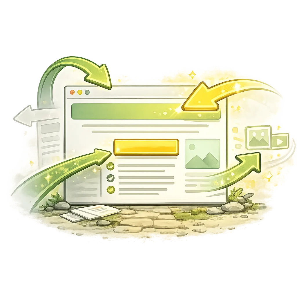
The 7 Core Elements of a High-Converting Landing Page
1. Clear Headline
Your headline must state:
Who it’s for
What it delivers
What outcome changes
Weak:
“Welcome to Our Platform.”
Strong:
“Build a Predictable Lead System in 30 Days.”
Clarity beats cleverness.
2. Subheadline That Expands
The subheadline should:
Add specificity
Clarify mechanism
Reinforce transformation
It supports the headline.
Not replace it.
3. One Dominant CTA
Multiple CTAs dilute action.
Choose one:
Start Free
Download Guide
Book Strategy Call
Get Access
We will cover CTA optimisation later in this pillar.
4. Visual Reinforcement
Use visuals that:
Support understanding
Show product interface
Demonstrate transformation
Not decorative stock photos.
Relevance increases trust.
5. Benefit Blocks (Not Features)
Features explain.
Benefits translate.
Feature:
“Weekly live sessions.”
Benefit:
“Get direct feedback so you avoid costly mistakes.”
Benefits move decisions.
6. Proof
Include:
Testimonials
Data
Case studies
Results
Proof lowers perceived risk.
Without proof, claims feel inflated.
7. Objection Handling
Address:
Price concerns
Time concerns
Difficulty
Risk
Remove hesitation before it forms.
REAL TALK
Most landing pages fail because they try to impress.
Design heavy.
Copy vague.
Message unclear.
Conversion is not aesthetics.
It is clarity under pressure.
Above-the-Fold Rule
Within the first screen view, a visitor should understand:
What this is
Who it’s for
What to do next
If they cannot answer those in 5 seconds, friction exists.
The Single-Page Principle
One page.
One audience.
One problem.
One solution.
One action.
Every additional option reduces focus.
COFFEE CUP TIP ☕
If your headline cannot be summarised in 10 words, simplify it.
STORY TIME
A SaaS founder had:
Modern design
Strong product
1.2% conversion rate
We changed:
Headline clarity
Reduced CTAs from 4 to 1
Added specific proof
Conversion increased to 3.8% in 6 weeks.
Same traffic.
Better clarity.
FAQ QUICK FIX
If your landing page underperforms:
1. Clarify headline
2. Remove extra CTAs
3. Add proof near top
4. Strengthen benefit language
5. Reduce distractions
Test one change at a time.
QUICK RECAP
Conversion = doubt reduction
One clear promise
One primary action
Proof reduces risk
Simplicity increases clarity
COMMON MISTAKES
Mistake: Multiple competing offers
Fix: Focus on one outcome
Mistake: Feature-heavy copy
Fix: Translate to benefits
Mistake: Weak headline
Fix: Clarify transformation
FAQ
Q: What is a good landing page conversion rate?
Varies by industry, but 2–5% is common baseline.
Q: Should I include navigation?
Usually no. Reduce escape routes.
Q: How long should a landing page be?
As long as needed to resolve doubt.
Q: Do videos increase conversions?
Sometimes — if they increase clarity.
TRY THIS TODAY
Open your landing page.
Ask:
“Can a stranger understand this in 5 seconds?”
If not, rewrite the headline.
NEXT STEP
Landing pages convert when the offer is positioned correctly.
Next:
→ How Do I Improve My Offer Positioning?
Because weak positioning kills strong pages.